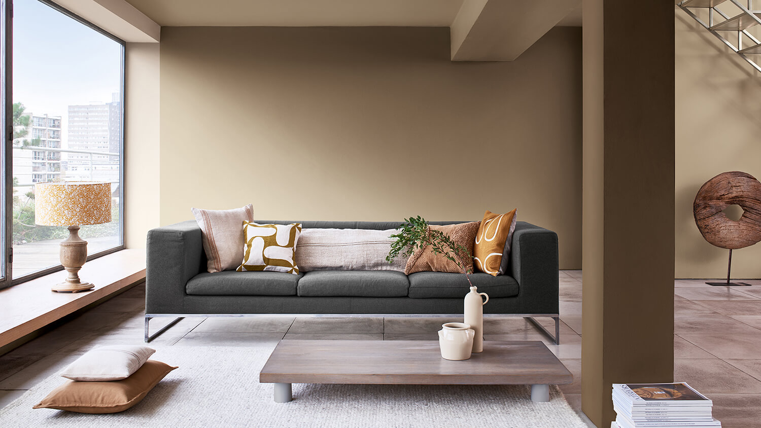
Dulux Colour of the Year 2021 | Brave Ground™
Good to see you!
Welcome to Dulux
Terms and Conditions
Thanks!
Our latest tips and inspirations are on their way to your mailbox
Registration complete
Forgotten your password?
Please enter email address associated to your account
Password changed successfully
We successfully updated your personal details.
Forgotten your password?
For more tailored inspiration, please fill in the 3 questions below.
Thanks for registering
We will send you colourful news every now and then
Delete Account
Making your home multifunctional while adding a breath of fresh air doesn’t have to be complicated. Simply use Dulux Colour of the Year 2022, Bright Skies™, and its complementary colours to zone different areas of an open-plan space. Here are four easy-to-achieve ideas…
Whatever the size of your open-plan space, zoning it into separate areas can help it work more effectively, particularly if it’s performing multiple roles – as living room, workspace and play area, for example. Paint is a great way to achieve this, as using different colours for different areas can give a space identity even without walls.
Dulux Colour of the Year 2022, Bright Skies™, and its palettes provide you with the perfect ready-made coordinating colour schemes to make zoning easy. How you use these combinations will depend on the zones you need, but Bright Skies™ and its colours can work together in multiple ways to bring a feeling of flexibility and a breath of fresh air to any open-plan space.
Here are four easy ways to zone using Dulux Colour of the Year 2022, Bright Skies™. For more ideas, watch the video.
If a relaxing space, such as a lounge or a bedroom, is the only place available for a desk and chair, choose a backdrop for the room that works for whatever you’re doing in it. Here, tones from the Workshop palette bring warmth, while a ceiling painted in Bright Skies™ adds a fresh, airy feel and a welcome connection to nature.
Which colours?
Tierra del Fuego 60YR 31/368
Bright Skies™ Blueberry Mash, 14BB 55/113
Spiced Honey™ 00YY 26/220
When a space needs to serve two purposes, such as this child’s room, splitting it with different colours is a clever solution. Bright Skies™ is just the right shade for inspiring focus and concentration, while a coordinating tone of muted mustard is perfect for play. A dividing line in a vibrant colour adds an extra highlight.
Which colours?
Tuscan Green 49YY 54/251
Cobra Bite 65YY 70/540
Bright Skies™ Blueberry Mash, 14BB 55/113
Single out a section of a larger room, such as this mezzanine-level office, with colour. Using one shade to define the space in this way, helps to separate work from relaxation, and Bright Skies™ is the perfect light and airy shade to boost concentration. The rest of the room, finished in soft shades of pale pink and muted mustard, becomes the perfect space for unwinding at the end of a busy day once work is over.
Which colours?
Bright Skies™ Blueberry Mash, 14BB 55/113
Olive Fantasy 34YY 31/502
Puccini Pink 10YR 57/080
Tuscan Green 49YY 54/251
If there’s a partial division between adjoining rooms, paint can help connect the two areas together. Here, a circle of Bright Skies™ echoes the colour of the walls beyond and draws the airy feeling of the sky from the office into the hallway.
Which colours?
Bright Skies™ Blueberry Mash, 14BB 55/113
Spiced Honey™ 00YY 26/220
Add a new job
Add a new job
Edit a job
Delete job
Are you sure? All notes, photos and saved items will be deleted.
Save colour
Save to My Workspace
Add to job
Save job


